Sticky Navigation Bar with Skrollr
Parallax scrolling seems to be all the rage in web design these days. It has a level of interactivity and richness that puts the old click-and-wait experience to shame. From simple and subtle (MMQB) to the complex (The Walking Dead), parallax can add a nice design flourish to most websites. Of course, even simple effects are not free.
While redesigning a small business website, I wanted to add a few small touches to jazz up the minimal content, so I decided to add a spice of scrolling animations to the site. In evaluating my options, I settled on Skrollr, which had the right mix of power and simplicity. Skrollr is driven by CSS and HTML tag attributes, meaning there is little complex JavaScript for the end user, plus it works seamlessly across desktop and mobile.
Adding a stick navigation bar that drops in from the top of the screen using Skrollr was fairly straightforward, with two caveats that I will cover at the end of the article.
If you want to get to the end result: JSFiddle
First, our HTML markup before adding Skrollr:
<nav class="wrap">
<div class="container">
<div class="five columns">My Company</div>
<div class="eleven columns last">
<ul>
<li><a href="#1">Item 1</a></li>
<li><a href="#2">Item 2</a></li>
<li><a href="#3">Item 3</a></li>
<li><a href="#4">Item 4</a></li>
</ul>
</div>
</div>
</nav>
Simple. Now, we can improve the style of the menu and also stick it to the top of the page via CSS. We'll also add some transparency so it appears the page is passing under the menu as we scroll.
nav {
background-color: rgba(255, 255, 255, 0.9);
border: 1px solid red;
height: 55px;
top: 0;
position: absolute; /\* hold tight... \*/
visibility: none; /\* we'll override these shortly \*/
z-index: 1000;
}

/\*\* some additional styling for navigation elements... \*\*/
At this point, we should have a nice little navigation bar. It's stuck at the top of the page and scrolls with the page though. Functionally, when the header is mostly off screen and then content is reaching the top of the viewport is when the navigation should slide in. Let's modify our HTML to include Skrollr.
<nav class="wrap"
data-anchor-target="#content"
data-200-top="opacity:0;"
data-150-top="visibility:visible; top: -55px; opacity: 0.3;"
data-100-top="opacity: 1; position: fixed; top: 0;">
<div class="container">
<div class="five columns">My Company</div>
<div class="eleven columns last">
<ul>
<li><a href="#1">Item 1</a></li>
<li><a href="#2">Item 2</a></li>
<li><a href="#3">Item 3</a></li>
<li><a href="#4">Item 4</a></li>
</ul>
</div>
</div>
</nav>
We're doing a few things above:
- We use the
data-anchor-targetattribute and provided CSS selector to identify the page element on which the animation frames are triggered. Skrollr by default uses the tagged element, but can reference on the page via CSS. - Animating the opacity, position, and visibility of the nav element. Skrollr handles the animation between the values, e.g. it "slides" the nav into place to animate the top position.
- Set the element as fixed on the page.
That's it. As you can see in the JS Fiddle, this requires only minimal code and its fairly straightforward, except for two items:
Frame Positioning
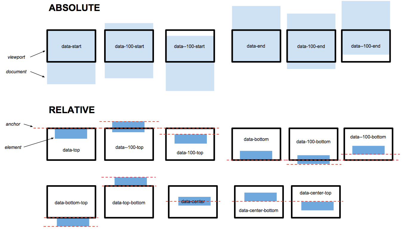
Skrollr supports both absolute and relative positioning on the page, which is useful, though it took me a bit to wrap my head around it (and some trial-and-error). In this case, we are monitoring how close the content element is from the top of the viewport - as it gets closer, we animate in the nav (starting at 200 pixels from top and completing at 100 pixels). There is a nice graphic on the Skrollr website that helps in this regard, but depending on the animation/effect you wish to create, you may need to experiment:

Mobile Support
The Skrollr website has a great overview of how the library compensates for deferred processing of JavaScript in mobile browsers to fake scrolling. Because our example has both fixed and non-fixed elements on the page, we need to add a skrollr-body element that contains the scrollable content of our page (note in the Fiddle that the nav is not in this block). If you do not include the skrollr-body element, your page will not scroll properly, if at all.
This is just one example of adding a few small enhancements to a simple page, Skrollr can enable much, much more.
References